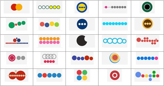
The images below show examples of color used with variety (left) and proportion (right): On your elements and principles matrix fill out the column for COLOR by creating your own miniature examples of these combinations.
0 Comments
Grab a rubric from my desk and review the project requirements again. While looking at your partially-completed color wheel project determine answers for the four questions below and respond by writing complete sentences in your journal:
Do you know your brand names? View the grid below and try to come up with as many correct company names as possible. You may work quietly with a neighbor or independently.
Tertiary colors are made by mixing primary colors with secondary colors. An example of this would be yellow-green. In your journal layer and label all the tertiary colors using colored pencil.
With a shoulder-partner, brainstorm things that are related to the color Red Create a comprehensive list in your journal! Today's journal brought to you by the color RED
What is your favorite color? In your opinion, what does that color symbolize?
What does that color say about you? After viewing the Power Point on color theory last class. Use the notes in your journal to describe the current color scheme you are wearing (if any). Use colored pencils to emphasize your design.
Get out your Elements and Principles of Art matrix. Begin to fill out the column for Value. Below is an example of value used with emphasis:
|
Journals
These 1 subject notebooks will be kept at school and assessed as 10% of the overall art grade. Students will be responsible for completing a response daily. aRCHIVES
April 2019
|